





Picking the wrong trophy size is a more common planning mistake than most organizers expect. Go too small, and your awards look underwhelming on stage. Go too large, and they become awkward to carry, expensive to ship, and difficult to store. Get the engraving layout wrong, and recipients squint to read their own names from two feet away.
This guide is written for the people planning these decisions—race promoters, tournament directors, corporate event planners, and HR teams tasked with ordering recognition awards. Whether you’re putting together a youth sports day or a national championship, the principles here apply. You’ll find practical advice on trophy sizing for 1st, 2nd, and 3rd place awards, how to design for stage visibility, best practices for engraving layout, logo placement, and how to build a clear visual hierarchy across award levels.
No design theory. No fluff. Just the practical planning information you need before placing your order.
Sizing follows the class list — see event award planning for the order the decisions come in.
Sizing follows the format and the artwork — see the full set of award buying guides.
Why Trophy Size and Layout Matter for Recognition and Visibility
How Award Size Impacts Perceived Prestige and Recognition
The size of an award communicates value before anyone reads a single word on it. A tall, substantial trophy signals that winning it means something. A small or flimsy award—regardless of how well-designed it is—can unintentionally diminish the achievement it represents.
This matters most in competitive settings. Audiences watching a podium presentation, parents photographing their children receiving medals, or employees watching colleagues honored at a corporate event all form an immediate impression based on the size and presence of the award. That first impression is difficult to override.
The trophy size guide principle here is simple: match the physical scale of the award to the significance of the achievement. Major championships warrant large, striking trophies. Participation awards or lower-tier recognition can be smaller and more modest.
The Role of Layout Design in Award Readability
Award layout design determines whether an engraving communicates clearly or becomes a jumble of hard-to-read text. Even a well-sized trophy loses impact if the recipient’s name is printed in a tiny font, crammed alongside a logo, event title, and date—all competing for the same small surface area.
Good layout design prioritizes hierarchy: what do you want people to read first? Usually it’s the recipient’s name, followed by the award title, then the event name and date. Supporting details like logos or taglines come last. When planners skip this step and simply list information in whatever order comes to mind, the result is cluttered engraving that looks unpolished in photographs and difficult to read from any distance.
Standard Trophy Sizes for Competitive Events
Typical Trophy Sizes for 1st, 2nd, and 3rd Place Awards
For competitive events, establishing a clear size progression between place awards is one of the most effective design decisions an organizer can make. A traditional and functional approach:
- 1st place: 45–60 cm (18–24 inches) or taller for major events
- 2nd place: 35–45 cm (14–18 inches)
- 3rd place: 25–35 cm (10–14 inches)
These ranges vary based on the type of event, the age group, and the budget available. For youth sports, a smaller 1st place trophy at 30 cm can still feel impressive. For a national championship or corporate flagship event, first place trophy size should command attention—often 50 cm or more, with additional design features like figurines, columns, or custom toppers.
The key is that the size difference between levels is visible at a glance. If 1st and 2nd place trophies are within a few centimeters of each other, the hierarchy collapses. Aim for a step change that’s apparent without measuring.
MX Trophies Sizes at a Glance
The ranges above are general guidance. These are the sizes MX Trophies actually makes, so you can plan a size ladder with real options. Sizes are as listed on each product page.
| Product | Sizes | Notes |
|---|---|---|
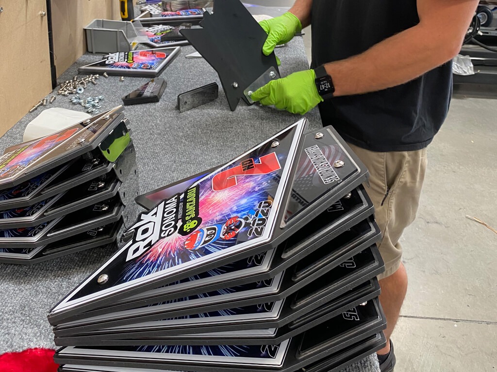
| Acrylic plate awards | 8″, 10″, 12″, 14″, 16″ | Laser cut to any outline, printed in full color |
| HD Series semi-custom | 10″, 12″, 14″, 16″, 18″, 20″ | Heavy marine board base; add layers or steel |
| WB Series semi-custom | 10″, 12″, 14″, 16″ | Wooden base with an acrylic main section |
| Wood plaques | 5″×7″, 6″×8″, 7″×9″, 8″×10″, 9″×12″, 10″×13″, 12″×15″ | Acrylic face or laser-etched wood |
| Acrylic medallions | 3″, 4″, 6″ | Cut to any shape, with a neck ribbon |
| Steel with acrylic medallions | 3″, 4″, 6″ | Printed acrylic on a steel backer |
| 2″ round medallions | 2″ | Artwork cast into metal |
| Pins | 1″, 1⅛″, 1½″, 1¾″, 2″ | Offset, die struck, soft enamel or cloisonné |
| Fully custom awards | Any size | Designed from scratch |
A simple podium ladder with acrylic plate awards, following the step-change rule above:
| Size | Best for |
|---|---|
| 8″ | Participation awards, youth classes, small events |
| 10″ | Standard class awards, 1st/2nd/3rd place |
| 12″ | Feature class winners, podium awards |
| 14″ | Championship trophies, overall winners |
| 16″ | Grand champion, headline sponsor awards |
For current prices, see each product page. Prices are not repeated here so they only live in one place. What drives the cost of custom awards explains what moves the price.
When Events Use Uniform Trophy Sizes Instead
Not every event needs a tiered size structure. Some competitions or recognition programs use matching trophies across all recipients—particularly where the goal is to celebrate participation equally, honor an entire team, or avoid singling out individuals by rank.
Corporate recognition awards often follow this model. Employee of the Month programs, for example, typically feature consistent award sizes to maintain fairness across departments. Team championship events where all members receive the same award also benefit from uniformity.
If you’re considering matching trophies for your event, custom award options allow you to personalize each piece with different engraving while keeping the physical form consistent.
Designing Awards for Stage Visibility
How Trophy Height Affects Visibility on a Podium
Stage presentations create a unique visibility challenge. Trophies are typically held at waist or chest height, photographed from a distance, and viewed by an audience that may be 10–30 meters away. An award that looks impressive on a desk can look completely lost during a podium presentation.
For podium events, aim for a minimum trophy height of 40 cm for primary awards. Taller is generally better for stage visibility, particularly in large venues or outdoor settings. Thin or narrow trophies can also disappear at distance even if they’re technically tall—consider width and visual mass as part of the podium trophy size decision.
Glass or crystal awards deserve special attention here. They can look stunning up close but may not photograph well under stage lighting unless they’re substantial in size or lit appropriately. If a stage presentation is central to your event, discuss this with your award supplier before finalizing designs.
Balancing Trophy Size With Event Budget and Logistics
Larger trophies cost more to produce and ship. They can also create logistical headaches—particularly for events where recipients need to travel home with their awards, or where you’re ordering large quantities across multiple event categories.
A practical approach for large events: invest in high-quality, statement-sized trophies for top-place finishers, then use smaller or alternative formats (plaques, medals, or acrylic awards) for participation and lower-tier recognition. This balances visual impact with budget efficiency.
For programs spanning multiple divisions or age groups, semi-custom award programs offer a cost-effective middle ground—consistent design across the program with room to customize engraving and sizing by category.
Best Practices for Award Text and Readability
Choosing the Right Font Size for Trophy Engraving
Engraving font size is a detail that gets overlooked until the trophies arrive and the text is unreadable. As a baseline:
- Recipient name: minimum 14–18pt, ideally larger for prestige awards
- Award title or event name: 10–14pt
- Supporting details (date, location, category): 8–10pt
These are general minimums. The actual readable size depends on the engraving method, the material being engraved, and the viewing distance. Laser engraving on acrylic or metal can achieve very fine detail, but fine detail is not the same as readable detail.
A good test: ask your supplier to confirm how the engraving will appear at life size before approving the final layout. What looks legible in a digital proof at 150% zoom on a screen may look far smaller on the finished piece.
Spacing Text and Graphics for Maximum Clarity
Crowded engraving is the most frequent layout problem in award production. Organizers try to include too much information in too little space, and the result is a visual mess.
Practical rules for award engraving layout:
- Limit engraving zones. Identify one primary zone (recipient name and award title) and one secondary zone (event details, logo). Keep them visually separated.
- Use generous line spacing. Lines of text packed too closely together are harder to read and look cheaper.
- Don’t fill every available space. White space (or blank material surface) improves readability and overall visual quality.
- Prioritize what matters. If someone picks up the trophy and reads one thing, what should it be? That information goes first, largest, most prominent.
For plaques and flat awards, plaque layout design follows the same hierarchy. Name and award title lead. Event details support. Logo anchors or frames the layout without dominating it.
Logo Placement and Graphic Balance on Awards
Where Logos Should Appear on Trophies and Plaques
Logo placement on trophies follows a consistent principle across most well-designed awards: logos frame the recognition, they don’t compete with it. The recipient’s achievement is the message. The logo confirms who’s behind it.
Common and effective logo placements:
- Top center or top of the engraving plate — positions the organization as the authority conferring the award
- Bottom center — subtle anchoring position, particularly useful when the award title is prominent
- Side or corner placement on plaques — works well for co-branded awards with multiple organizational logos
Avoid placing logos directly beside recipient names at the same scale. This creates visual confusion about what the award is actually for.
Maintaining Visual Balance Between Logos, Text, and Titles
The most common logo problem isn’t placement—it’s scale. Logos submitted for engraving are frequently too large relative to the text, which throws the whole layout out of balance. A logo that dominates a plaque can make the award feel more like promotional material than a personal recognition piece.
A reliable proportion: logos should occupy no more than 20–25% of the total engraving area. If you’re using multiple logos (a sponsor logo alongside an organizational logo, for example), reduce each proportionally and ensure they’re aligned consistently.
For corporate recognition awards in particular, maintaining brand consistency while keeping the recipient at the center of the design is a balancing act worth resolving before you submit artwork for production.
Establishing Award Hierarchy for Competitions and Events
Using Size and Design to Differentiate Award Levels
Size alone creates hierarchy, but combining size with material or design complexity strengthens it further. A tiered approach that many event organizers use effectively:
- 1st place: Largest size, premium material (crystal, metal, or custom figurine), full engraving
- 2nd place: Mid-size, quality material, engraving
- 3rd place: Smaller, clean design, engraving
- Finalists/participants: Medals, ribbons, or smaller plaques
This structure ensures that when all awards are displayed together—at a ceremony, on a shelf, or in a photograph—the hierarchy is immediately legible. Trophy hierarchy design is about communicating value visually, not just textually.
Visual Techniques for Distinguishing Championship Awards
Championship or premier-tier awards benefit from design elements that set them apart beyond size. Consider:
- Custom figurines or toppers specific to the sport or discipline
- Multi-tier bases that add height and visual presence
- Premium materials such as optically clear crystal or brushed metal
- Color differentiation — gold tones for 1st, silver for 2nd, bronze for 3rd
These premium award design choices signal that winning this award is genuinely meaningful. For flagship events or annual championships, exploring custom trophy options gives you the flexibility to create something distinctive rather than selecting from standard catalogue items.
Common Trophy Layout Mistakes Event Organizers Make
Overcrowded Engraving and Small Text
The instinct to include every detail—full event name, category, division, date, location, and recipient name—is understandable, but it regularly produces unreadable engraving. When text is reduced to fit, everything shrinks, including the recipient’s name.
If you find yourself needing to include extensive detail, consider using two separate engraving areas (front and back) or simplifying the information. A trophy that clearly shows a name and award title reads better—and photographs better—than one that crams in five lines of 7pt text.
Poor Logo Placement and Visual Imbalance
Submitting a logo without checking how it scales to the award surface is a reliable path to layout problems. A high-resolution logo intended for a banner will often overwhelm a small engraving area when imported without adjustment.
Before finalizing an order, request a scaled layout proof that shows exactly how all elements—name, title, logo, and date—will appear on the finished award. This step catches bad trophy design decisions before they’re permanently engraved.
Planning Trophy Sizes for Different Types of Events
Competition Awards vs Corporate Recognition Awards
The planning priorities are different for competitive and corporate programs. Competitive events typically emphasize hierarchy—clear differentiation between 1st, 2nd, and 3rd—along with stage visibility and category consistency across multiple divisions.
Corporate recognition programs tend to prioritize uniformity, brand alignment, and personal recognition. An employee award is usually presented in a one-on-one or small-group setting rather than a large stage event, which changes the size and design considerations significantly. A well-designed A4 plaque often creates more personal impact in a corporate context than a tall trophy.
Both program types benefit from planning the full award suite before placing individual orders. Review custom award options and corporate recognition awards side by side when mapping out a multi-tier program.
Choosing Award Sizes for Large Tournaments or Series
Multi-division tournaments—such as regional sports competitions, annual league seasons, or multi-category corporate recognition programs—create scale challenges. Ordering consistent award sizes across dozens of categories, then personalizing each with division-specific engraving, requires planning well in advance.
For these programs, semi-custom award programs are worth exploring. They provide a consistent visual identity across the full program while allowing category-level customization in engraving and sizing. They also typically offer better per-unit pricing for bulk orders than fully custom designs.
The practical rule for large tournaments: decide on your size tiers first, then confirm quantities by category. Changing sizes after production begins is expensive and sometimes impossible within typical event lead times.
Take the Guesswork Out of Award Planning
Trophy and award design involves more decisions than most event organizers anticipate until they’re in the middle of an order. Size, layout, engraving readability, logo placement, and visual hierarchy all feed into whether an award ceremony looks polished or falls flat.
The practical starting point: define your award levels and the visual hierarchy you want before choosing specific products. Know what 1st place should look like relative to 3rd place. Decide what information must appear on each award, and what can be cut. Confirm logo files are sized correctly before submitting artwork.
Good award design is mostly good planning. Work through these decisions early, and the production process becomes significantly smoother—and the finished awards significantly better.
Ready To Get Your Event Awards Started?
Elevate your event with FREE Design & Fast Shipping custom acrylic awards & trophies! Order high-quality, custom designed acrylic plate awards plaques and trophies for sports, racing, and more. Fast shipping, affordable prices.
Browse Our Trophies & Awards
Category names, sponsor marks and an event year all have to fit the same layout at a car show — see car show awards.


