Blog
How colors, themes, and consistent design turn trophies into part of your event brand.
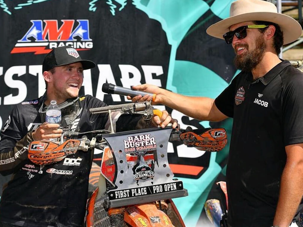
Trophies are one of the most visible parts of your event setup. They show up in podium photos, sponsor recaps, and social media feeds long after the final moto. When your awards match your overall event identity, the entire race feels organized and professional.
Why Trophies Are Part of Event Branding
Most promoters treat awards as an afterthought. They focus entirely on track prep, ticketing, and vendor rows, leaving the hardware for the last minute. But trophies are the ultimate takeaway from your race.
Visual consistency across the event matters. When a rider walks away with a piece of hardware, that item reflects the prestige of your race. First impressions count, especially when riders and sponsors are deciding which series to support next season.
Sponsors care heavily about how their brand is presented alongside yours. If the awards look disjointed from the rest of the race, it diminishes the perceived value of their investment. Strong racing event branding shows sponsors you take presentation seriously.
Trophies are not separate from the track experience. They are a physical extension of it. When photos circulate online, a cohesive design tells everyone exactly which race that hardware came from.
Using Color to Reinforce Your Event Identity
Colors trigger immediate brand recognition. Think of the major energy drink brands in motocross—you know their primary colors without seeing a logo. Your dirt bike event design should operate the same way.
Matching Event Color Schemes
Use your brand colors consistently across every piece of hardware. If your series relies on neon green and black, those colors need to dominate the award plates and structural elements. Avoid pulling random colors out of a catalog just because they look interesting on a screen.
Every color choice should tie back to your main logo or series artwork. This creates a unified look that riders recognize instantly. When your awards match the banners behind the podium, the visual impact multiplies.
High-Contrast for Visibility
Outdoor lighting can be harsh, blowing out subtle colors and gradients. Colors that pop in outdoor lighting ensure your awards stand out on a sunny podium. You need high contrast between the background material and the text.
Readability in photos is crucial. A dark grey logo on a black background might look sleek up close, but it disappears from ten feet away. Use bold, contrasting colors to make sure class names and sponsor logos remain visible in every cell phone picture.
Color Hierarchy
Not every color needs to shout. Establish a clear hierarchy using your primary and secondary colors. Your main brand color should command the most attention, while secondary colors serve as accents or borders.
Keeping it clean prevents the design from becoming chaotic. Too many competing colors distract the eye and make the award look messy. A disciplined approach to color creates a much stronger visual statement.
Designing Around Event Themes
A strong theme gives your event character. The best custom motocross trophies capture that character in a physical object.
Race Style Themes
Your hardware should match the vibe of your race. An aggressive, high-energy arenacross series demands sharp angles, dark metals, and bold typography. The awards should feel as intense as the racing itself.
On the flip side, a clean and professional national qualifier might lean toward traditional shapes, brushed aluminum, and precise laser engraving. For a local, grassroots track, you might want something rugged and community-focused. The design language must fit the environment.
Incorporating Track or Location Elements
Riders love awards that feel specific to the track they just conquered. Incorporating track outlines into the background of the design adds an immediate localized touch. It proves the award was made specifically for that day.
You can also lean into regional identity. A race in the desert can utilize colors and shapes that reflect the environment, while a Pacific Northwest race might incorporate forestry elements. Event-specific shapes turn standard awards into genuine memorabilia.
Avoiding Overdesign
More elements do not equal a better design. Cramming a track map, five sponsor logos, a rider silhouette, and three different fonts onto one piece of metal weakens the impact.
Give the key elements room to breathe. Negative space helps the important details stand out. Simple, bold designs almost always photograph better than cluttered ones.
Consistency Across All Awards
Nothing hurts motocross event branding more than a mismatched prize table. When the 50cc class gets standard plastic cups and the Pro class gets laser-cut acrylic, the event feels disjointed.
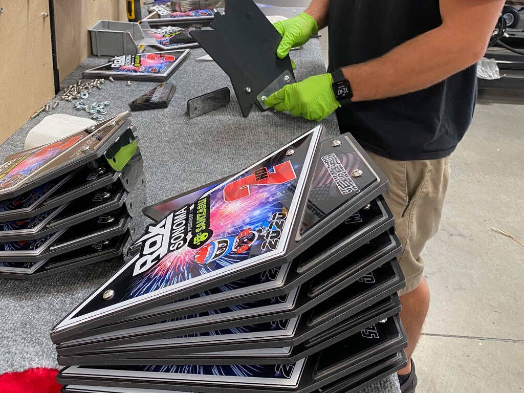
Keeping the design consistent across all classes unifies the race. You do not need to give everyone the exact same size award. Instead, scale the sizes while keeping the core shapes, fonts, and colors identical.
This rule applies when matching trophies, medals, and plaques. Even if the formats change, the visual language must remain the same. Repeating visual elements proves the event is organized and professional from top to bottom.
Branding Across the Entire Event
Hardware is just one piece of the puzzle. Your awards should look like they belong next to your banners, flags, and signage.
When you order custom fabrication, you are building a matching design language. The font on the podium backdrop should be the exact font on the first-place plate. The accent colors on the track markers should echo the accent colors on the hardware.
This creates a cohesive event setup. When every physical item shares the same DNA, the race feels like a premium property. This level of detail makes a massive difference to riders, parents, and paying sponsors.
Designing for Photos, Media & Social
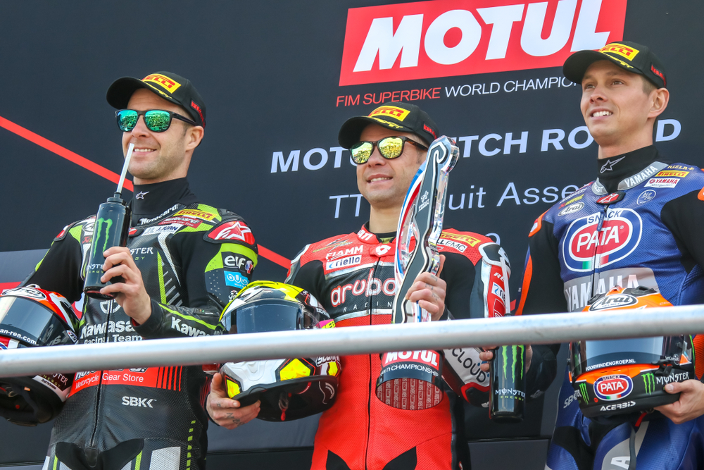
Your event lives on long after the track is torn down. Podium shots fuel the marketing for your next race. If the awards look incredible in those shots, your marketing gets an instant upgrade.
Social media sharing drives modern racing event branding. Riders love posting photos of their hardware. When they hold up a bold, easily readable award, your event logo gets blasted to their entire following.
Sponsor exposure relies heavily on these photos. Sponsors pay to be seen. If their logos are visible and legible from a distance, they get a clear return on their investment. If it looks good in photos, it extends your event reach.
Balancing Branding with Functionality
It is easy to get carried away with complex shapes and thin materials. But awards are handled, dropped, and packed into gear bags. You cannot sacrifice durability for design.
Keep the structures stable. A tall, top-heavy piece might look aggressive on a screen, but it will blow over in the wind on a dirt podium. Use solid bases and appropriate thicknesses to ensure they stand upright.
Avoid overly complex builds with fragile edges. Dirt bike event design needs to survive the dirt bike environment. Practical expertise dictates that a sturdy, bold design will always outperform a fragile, intricate one at a motocross track.
Common Event Branding Mistakes
We see the same errors repeated across the industry. The most glaring mistake is inconsistent designs across different awards. Mixing generic catalog parts with a few custom pieces makes the whole event look cheap.
Ignoring color matching is another frequent error. Using a generic royal blue when your brand uses a specific teal creates visual friction. Close enough is never actually close enough when it comes to branding.
Overloading designs with too many elements ruins legibility. Treating the hardware as an afterthought rather than a core part of the marketing strategy guarantees missed opportunities for sponsor exposure and social reach.
How We Approach Event Branding Through Awards
We do not start by looking at a catalog of parts. We start with your event identity. We look at your logo, your colors, and the overall vibe of your race series.
By designing around your branding first, we ensure the final product looks like it belongs exclusively to your event. We build out a design language that can be scaled up for the pros and scaled down for the amateur classes.
Keeping consistency across all elements is our priority. Whether you need heavy-duty metal pieces or cost-effective acrylics, they will all share the same visual DNA.
Real-World Example
Consider a recent regional championship series we worked with. They had a strong, established logo featuring bold orange and gunmetal grey. Their banners and podium backdrops heavily utilized this color scheme.
We designed a custom shape that mirrored the aggressive angles of their primary logo. Every award, from the massive Pro class hardware to the smaller youth class plaques, used the exact same orange and gunmetal layers.
The result was striking. Every podium photo featured perfect color matching between the backdrop and the hardware. The sponsor logos popped, and the event looked like a top-tier national race.
Build Your Cohesive System
To fully elevate your event, you need to think beyond single items. Learn more about the core elements of motocross trophies and how they set the standard for your series.
If you are bringing outside money into your race, understanding sponsor branding for motocross trophies is essential for keeping those partners happy.
Looking for inspiration? Review our motocross trophy ideas to see how different shapes and themes come to life. You can also explore the various types of motocross awards available to fit different budgets and classes. Finally, understanding motocross trophy materials will help you balance durability with your specific design goals.
Want Your Event to Look Cohesive and Professional?
We design trophies and event elements that match your branding and elevate your entire event. Stop settling for hardware that clashes with your hard work.
Get a Custom Quote and Start Your Design today.
Frequently Asked Questions
Should trophies match event branding?
Yes. Matching your hardware to your overall event branding ensures visual consistency. This makes your race look more professional and creates better marketing material for future events.
How do you choose colors for trophies?
Pull colors directly from your event logo or series branding. Establish a primary color for the main structure and use secondary colors for accents to ensure high contrast and readability.
Can trophies match logos and signage?
Absolutely. Custom fabrication allows the exact fonts, colors, and shapes from your signage to be replicated on your hardware. This creates a unified look across the entire facility.
What makes an event look professional?
Consistency. When the banners, track markers, podium backdrops, and awards all share the same design language, the event feels highly organized and premium.
How do you keep designs consistent across awards?
Establish a core design theme—including specific shapes, fonts, and colors—and scale it up or down depending on the class or finishing position. The materials or sizes can change, but the visual DNA remains the same.
Ready To Get Your Event Awards Started?
Elevate your event with FREE Design & Fast Shipping custom acrylic awards & trophies! Order high-quality, custom designed acrylic plate awards plaques and trophies for sports, racing, and more. Fast shipping, affordable prices.
Learn More