Blog
Logo placement, layering, and visibility strategies that actually work on race day.
Sponsors expect visibility, not just placement. Trophies act as a core component of your overall event branding and visual identity. Done right, they reinforce both the event and the sponsor presence long after the race is over.
Why Sponsor Branding Matters on Trophies
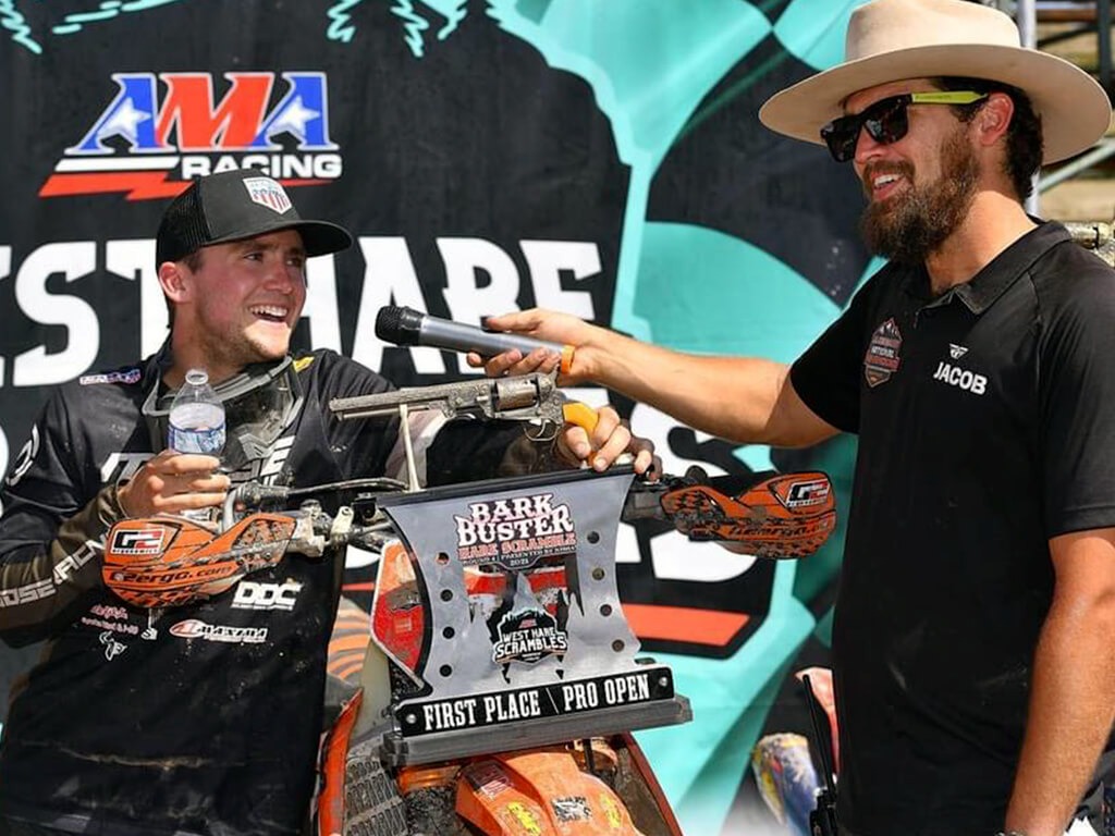
Sponsors fund racing events because they want their brand in front of riders, families, and fans. When you integrate sponsor logos on trophies, you deliver a tangible return on their investment. These awards do not just sit on a shelf. They are photographed, shared on social media, and displayed proudly by the winners.
Every time a rider holds up their award on the podium, your sponsors get direct media exposure. Treating trophies as marketing assets rather than just participation hardware elevates your event professionalism. This attention to detail builds trust and encourages long-term sponsor relationships.
Securing funding for future races relies heavily on how well you treat the brands supporting you today. Effective motocross trophy branding proves to your partners that you understand the value of their contribution.
Logo Placement: Where It Actually Works
Dumping a logo onto a flat surface without thinking about the final layout helps no one. Logo placement requires a strategic approach to ensure the brand is readable from a distance.
Primary Logo Positioning
Your title sponsor deserves the most prominent real estate. This usually means positioning their logo front-facing and at eye-level on the main body of the award. The goal is to make sure it remains completely unobstructed when the rider holds the trophy.
Front-facing placement guarantees the logo will be fully visible in photos. If the primary logo sits too high or too low, a rider’s hand or arm might cover it during the podium celebration.
Secondary Sponsor Placement
Lower-tier sponsors still need clear visibility, but they should not compete with the title sponsor. The best spots for secondary sponsor placement are on the lower tiers, base plates, or side panels.
These areas remain visible during close-up shots and display well on a shelf. Make sure the font and logo scale remain readable. Shrinking a logo down to the size of a postage stamp defeats the purpose of including it.
Avoiding Clutter
Trying to fit fifteen different sponsors onto a single award is a guaranteed way to ruin the design. Too many logos reduces the impact for everyone involved.
Prioritize a strict visual hierarchy. If a sponsor only contributed a small amount of product, they might belong on an event banner rather than the primary hardware. Keep the layout focused so the brands that paid for premium placement actually get it.
Layering & Design Integration
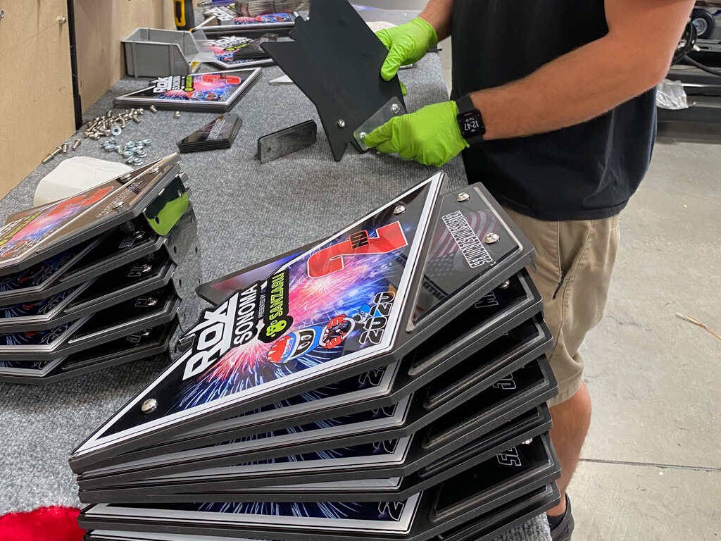
Logos should feel built into the trophy, not stuck on as an afterthought. Modern fabrication techniques allow you to integrate sponsor branding directly into the physical structure of the award.
Layered Acrylic Design
Using layered acrylic allows you to stack different logos and text elements on top of one another. This creates physical depth and visual separation between the event branding and the sponsor branding.
By placing the sponsor logo on a raised acrylic layer, it catches the light differently and stands out from the background. This depth makes the entire award look custom-built rather than mass-produced.
Integrating Logos into Shapes
Instead of using standard rectangular plaques, shape the backplate to match the event’s theme. You can integrate logos directly into track outlines, custom number plate styles, or specific event branding shapes.
A title sponsor’s logo placed inside a precisely cut number plate design looks incredibly professional. It shows sponsors that you took the time to build the award around their brand.
Clean vs Complex Layouts
There is a fine line between a visually striking design and a messy one. Know when to simplify your layout. If your title sponsor has a highly detailed, colorful logo, keep the surrounding background clean and neutral.
Conversely, if the sponsor uses a stark, single-color wordmark, you can afford to build more complexity into the structural layers of the trophy itself. Balance the visual weight so the text remains entirely legible.
Visibility on the Podium
If a logo does not show up in photos, it does not exist. Podium visibility is the ultimate test of effective racing event branding.
Consider the camera angles used at most local and regional races. Photographers shoot from the ground up, looking toward the podium. Riders hold the trophies by the sides or the base. If you place a critical logo right where a muddy glove will grab it, the sponsor loses their moment.
Lighting conditions also play a huge role. Outdoor events deal with harsh sunlight, deep shadows, and glare. Using matte finishes behind glossy logos can help reduce glare and keep the branding readable.
Think about the distance from the audience. The text must be thick enough and large enough to be identified from thirty feet away. Fine, delicate scripts almost never work on race day hardware.
Designing for Multiple Sponsors
Handling multiple sponsors requires a clear strategy. You have to balance competing brands without making the award look like a crowded billboard.
Sponsor Hierarchy
Establish a strict sponsor hierarchy before you begin the design phase. The title sponsor gets the largest footprint, typically placed front and center. Presenting sponsors take the secondary spots, scaled down by roughly thirty to fifty percent.
Balancing Visibility
Not all logos should be equal. If two supporting sponsors have vastly different logo shapes—one tall and vertical, one wide and horizontal—you have to scale them by visual weight, not just physical dimensions. This ensures neither brand overpowers the other in their designated tier.
Avoiding Overload
Too many logos kills design clarity. If you try to force ten logos onto a ten-inch award, the result is an unreadable mess. Be honest with your promoters about what fits. Sometimes, it is better to group smaller sponsors onto a designated side panel or base plate to keep the main focal point clean.
Branding Consistency Across Awards
Advanced planning allows you to create a recognizable system across your entire event. Branding consistency matters when you are handing out custom motocross awards for different classes and age groups.
Keep your sponsor placement rules consistent across all classes. If the title sponsor sits at the top center for the Pro class, they should sit at the top center for the Novice class. Repeating this sponsor placement builds strong visual recognition.
Creating a recognizable system makes the photographer’s job easier, too. They will know exactly how to frame the shot to capture the rider and the sponsor branding simultaneously.
Common Sponsor Branding Mistakes
Even experienced promoters make critical errors when trying to incorporate sponsor branding. Recognizing these pitfalls saves time, money, and sponsor relationships.
The most common mistake is scaling logos too small to read. If you have to squint to read the company name while holding the award in your hands, it will be invisible in a social media photo.
Poor placement is another frequent issue. Hiding a logo in the tight angles of a complex geometric design means shadows will obscure it.
Overcrowded designs look cheap. Stacking too many contrasting colors and fonts next to each other creates visual chaos. Finally, inconsistent branding across trophies makes the event look disorganized. The Pro class hardware should look like it belongs to the same family as the Amateur class hardware.
How Branding Connects to Materials & Design
The materials you choose directly impact how well a sponsor logo translates to the final product. Different substrates handle ink, engraving, and light in vastly different ways.
Acrylic works exceptionally well for sponsor logos because it allows for crisp, full-color UV printing. It handles complex gradients and exact brand color matching effortlessly. When you understand motocross trophy materials, you can guide sponsors toward the best possible representation of their brand.
Layering improves visibility by physically separating the text from the background. This is especially important when using dark or highly textured backing plates. The material affects print quality, so always choose smooth, non-porous surfaces for primary logo placement.
Real-World Example: The Regional Championship
Consider a recent regional championship that featured one title sponsor and three supporting sponsors. The organizers needed a design that highlighted everyone without looking cluttered.
We used a layered acrylic approach. The background featured the event logo cut into the shape of a gear. We floated a contrasting white acrylic plate off the background to house the title sponsor’s logo in vibrant, full-color print.
The three supporting sponsors were printed in a clean, single-color format along the solid base. On the podium, the title sponsor stood out perfectly against the rider’s gear, while the supporting sponsors remained entirely legible in the close-up shots. The sponsors were thrilled with the media exposure.
Internal Linking Section
Building a comprehensive award strategy requires understanding all your options. If you are starting from scratch, explore our main guide on motocross trophies to see our full capabilities.
Understanding the physical build process helps, so be sure to review our breakdown of motocross trophy materials. If you need inspiration for your next layout, our motocross trophy ideas page showcases various successful builds.
You can also learn about the different types of motocross awards available for your specific classes. Finally, if you are scaling up, read our thoughts on designing for local vs national motocross events to ensure your hardware matches the prestige of the race.
Need Sponsor-Ready Trophy Designs?
We design awards that highlight your sponsors and hold up on race day—visually and structurally. Stop settling for generic hardware that does nothing for your event’s marketing power.
Your sponsors pay for visibility. We make sure they get it.
Frequently Asked Questions
How many sponsor logos can you add to a trophy?
We recommend limiting it to one title sponsor and two to three supporting sponsors for maximum clarity. Adding more than four logos typically results in a cluttered, unreadable design.
Where should logos be placed for visibility?
Primary logos should sit front and center, typically on the upper half of the main body. This ensures they remain unobstructed by the rider’s hands and are highly visible in standard podium photography.
Do logos fade or wear off?
When printed correctly using UV-cured inks on appropriate materials like acrylic, logos will not fade or scratch off easily. They are designed to withstand the dirt, sun, and handling associated with race day.
Can you prioritize certain sponsors?
Absolutely. We prioritize sponsors using a combination of size, placement, and physical layering. Title sponsors receive the largest dimensions and the most prominent visual real estate on the award.
What’s the best material for branded trophies?
Acrylic is generally the best material for crisp, full-color sponsor branding. It takes UV printing perfectly, allows for exact brand color matching, and can be layered to create physical depth that highlights the logo.
Ready To Get Your Event Awards Started?
Elevate your event with FREE Design & Fast Shipping custom acrylic awards & trophies! Order high-quality, custom designed acrylic plate awards plaques and trophies for sports, racing, and more. Fast shipping, affordable prices.
Learn More